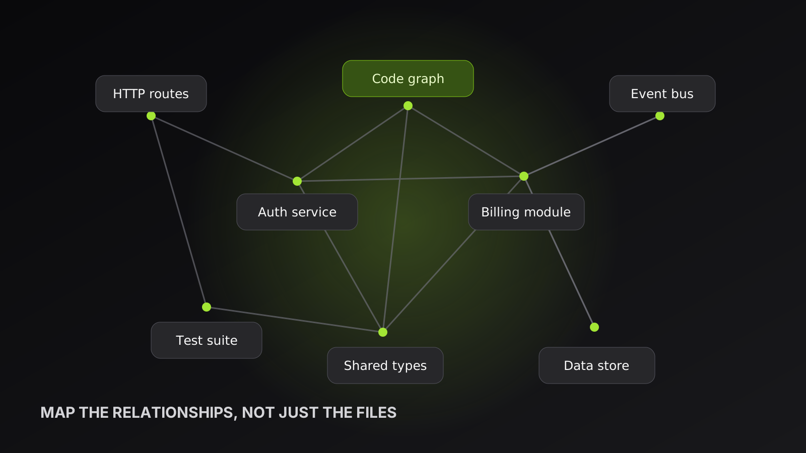
Large repositories become difficult long before they become impossible to search. The real problem is that developers can find files but cannot quickly see how those files cooperate. Codebase visualization turns the repository from a list of paths into a model of relationships.
Start with the question, not the diagram
There is no single perfect map. A new engineer asks where the major subsystems live. A reviewer asks what a pull request could break. An incident responder asks how a request travels from an endpoint to a database write. Each question needs a different projection of the same underlying graph.
An architecture view groups modules and packages. A call graph follows runtime relationships between functions. An import graph exposes coupling. A hotspot view combines centrality or churn with dependency counts to show where changes deserve extra care. The best code visualization tool lets you move between these views without rebuilding your understanding from scratch.
What belongs in a code map
A practical map begins with files, functions, classes, types, and modules. It then adds typed edges such as defines, imports, calls, implements, and depends on. Typed relationships matter because a line between two boxes is ambiguous. A call carries a different risk from a shared type import, and both differ from simple co-location.
Ranking also matters. A graph containing fifty thousand symbols is technically complete but visually useless. Centrality scores, filters, and neighborhood queries help a developer begin with important nodes and expand deliberately.
Mapping a large repository step by step
First, generate a top-level skeleton of packages and entry points. Second, identify the central modules with the most meaningful inbound relationships. Third, select a user-facing flow and trace it across boundaries. Finally, inspect hotspots where high fan-in combines with frequent change. This sequence moves from orientation to risk without overwhelming the screen.
For example, a payment flow may begin at an HTTP route, pass through validation and an application service, call a provider adapter, then publish an event. Seeing that path makes hidden responsibilities obvious. It also reveals whether business logic has leaked into transport code or whether several routes bypass the intended service.
Keep visualizations connected to source
A diagram that cannot return you to code quickly becomes documentation debt. Every node should retain a precise file and line anchor. The map should be regenerated from the repository rather than maintained by hand, and it should reflect the active branch. Otherwise developers learn to distrust it.
OpenVisio builds these views from parsed source and keeps the same graph queryable by both humans and AI coding agents. A developer can explore visually, while an agent asks for callers, dependencies, or a focused neighborhood over MCP.
A practical review checklist
Before sharing a visualization, test it against real engineering questions. Can a new teammate locate the application entry points? Can a reviewer expand one changed symbol to its callers? Can an incident responder follow a request across a service boundary? Can every visible symbol open the matching source location? If the answer to any of these is no, the view is decoration rather than an operational map.
Use progressive disclosure to keep the result readable. Start with packages and services, reveal files when a package is selected, and show symbols only around the active investigation. Preserve filters and navigation history so a developer can move up and down the abstraction ladder without losing their place. For monorepos, make ownership and deploy boundaries first-class: two folders can sit beside each other while having completely different release schedules and risk profiles.
Finally, label what the parser cannot know. Runtime dependency injection, generated code, framework conventions, and string-based dispatch may create edges that static analysis cannot prove. A trustworthy map distinguishes observed relationships from inferred ones and gives developers a way to inspect the evidence.
Design views for distinct jobs
An executive architecture view and a debugging view should not share the same level of detail. The first should emphasize services, ownership, deployment boundaries, and the direction of data flow. The second should expose functions, call sites, conditions, and source anchors. A refactoring view needs fan-in, fan-out, test coverage, and recent change frequency. Treating these as filters over one typed graph keeps the views consistent while allowing each person to see only what helps.
Layout stability is equally important. If unchanged nodes jump to new positions on every refresh, developers spend time relearning the picture. Preserve coordinates where practical, highlight the changed neighborhood, and make direction obvious with restrained color and edge styling. Search, keyboard navigation, breadcrumbs, and a reliable back action matter more than decorative animation on a working map.
Keep the map operational
Choose a refresh policy that matches the repository. Small projects can rebuild on every meaningful change. Large monorepos usually need incremental indexing with a periodic clean rebuild. Surface progress and the indexed revision so nobody mistakes a partial graph for a complete one. Generated files, vendor directories, fixtures, and build output should have explicit inclusion rules.
Ownership also belongs in the map. Connect packages to teams, runbooks, deployable units, and criticality where that metadata exists. During an incident, the useful question is not merely which function calls another; it is who can explain that boundary and how the affected component is released. A codebase visualization earns its place when it supports onboarding, review, refactoring, and incident response without becoming another diagram someone must remember to update.
Codebase visualization works when it shortens the distance between a question and verifiable source. The prettiest graph is not necessarily the best. The best graph helps someone choose the correct file, understand the blast radius, and make the next change with fewer surprises.
- codebase visualization
- dependency graph
- software architecture
- code mapping
Put your team and your agents in one workspace
Create tickets, assign them to people or coding agents, and follow the work from channel to pull request.
Get started free